🎯 Architectural Ethos
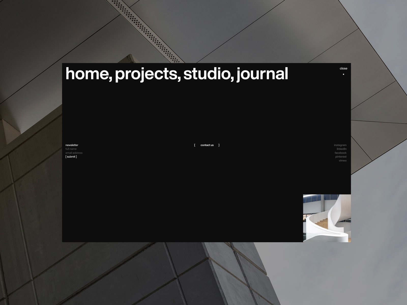
The website features a clean, minimalistic interface that mirrors the studio’s architectural aesthetic—simple layouts, subtle animations, and ample white space reflect the firm’s focus on clean lines, functional elegance, and measured restraint. The restrained palette of blacks, whites, and muted grays echoes DHK’s design DNA—quiet, confident, and considerate—offering visitors a sense of calm professionalism immediately upon arrival.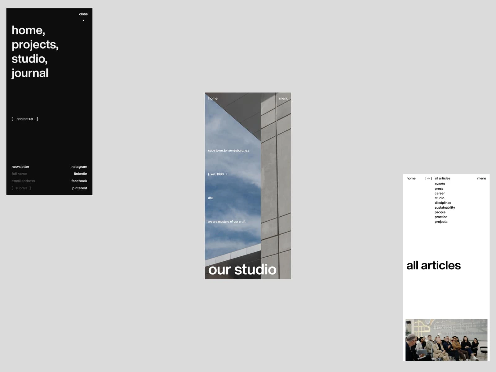
🚀 Performance & Load Speed
According to web monitoring data, dhk.co.za has historically loaded within approximately 2.0 seconds (ranging from 1.7 to 2.6 s) . In practical terms, this means a visitor’s journey from landing to content is smooth, with fast thumbnail rendering and minimal blocking of user interactions. That said, with modern performance standards targeting sub-1.5 seconds, there’s room to optimize further—particularly on mobile and slower connections.🧠 Thoughtful & Strategic Content Curation
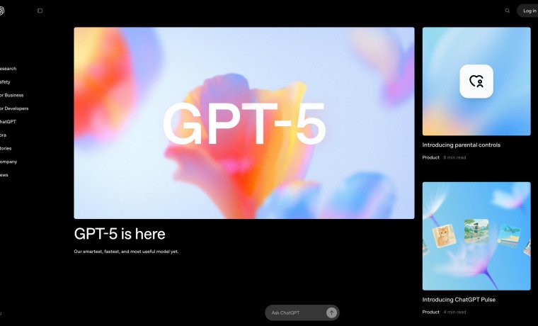
The site is expertly curated: a fullscreen hero with “scroll to discover our craft” guides users intuitively down a homepage rich with carefully selected sections—company ethos, featured projects, leadership bios, and awards. The “featured projects” section spotlights recent works like “Longkloof Precinct (2024)” and “The Rubik (2024)”, drawing attention to current, high-profile work while offering “view all projects” access . It’s a streamlined narrative that feels intentional and brand-forward.✨ Other Stand‑out Features
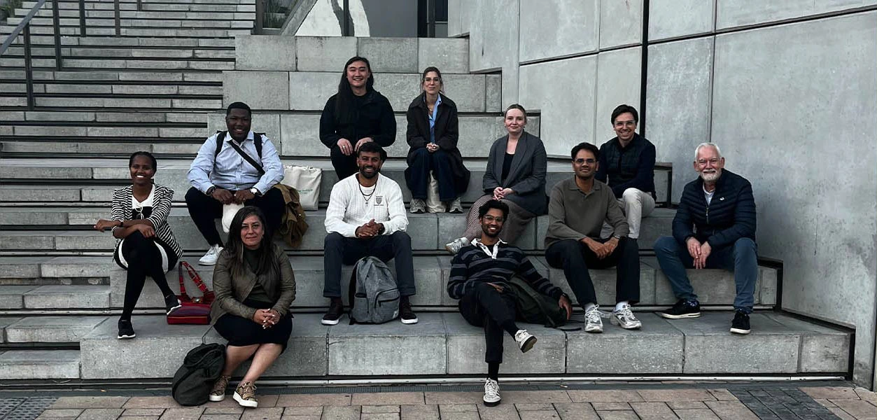
Beyond aesthetics and structure, the site is smartly built and enhanced with modern touches. High-definition project imagery and embedded award listings underscore studio credibility. The leadership page includes individual profiles that reinforce professional depth. Additionally, the content is seamlessly split between architecture and interior design (including a dedicated subdomain for dhki), reflecting the organization’s multidisciplinary capabilities .🛠️ Suggested Improvements & Broader
Takeaways A few refinements could elevate the user experience: 1. Implement lazy-loading and serve images via WebP or responsive formats to improve performance and SEO. 2. Enhance menu labels and provide visible hover/active states to improve navigation intuitiveness. 3. Improve accessibility, adding alt-text, ARIA labels, and ensuring color contrast meets WCAG guidelines. From an architectural firm’s perspective, the site is a strong exemplar: minimalist design, well-curated content, and visual consistency that echoes its built work. Other studios should note how the site subtly aligns digital presence with physical design philosophy—less is more, and every design choice reinforces brand identity. A bit more polish on performance and accessibility would complete the picture.Summary
Capturing the spirit of a fresh, forward-thinking architectural collective. Overall, dhk.co.za showcases a harmonious marriage of form and function: elegant, intuitive, and purposeful, with small areas of improvement that, if addressed, would elevate it from very good to exemplary.Visit Website
Get the edge with customized design and development for your organization!